Wondering which North Little Rock neighborhood is moving the fastest right now? When you are choosing between Argenta, Park Hill, and Lakewood, a clear price and inventory snapshot can save you time and stress. You want real numbers and plain‑English guidance so you can act with confidence.
In this guide, you will learn how to read a neighborhood snapshot the way a local pro does. You will see which metrics matter, how to compare momentum across Argenta, Park Hill, and Lakewood, and what the signals mean for your next move. Let’s dive in.
How to read this snapshot
A great snapshot is simple, consistent, and tied to time windows that make sense. Here is what to look for and why it matters.
Key metrics that matter
- Median sale price. Gives you the middle of the market and protects against outliers. Use it to watch price direction.
- Days on market. Look at median DOM for closed sales and average DOM for active listings. Faster movement often signals stronger demand.
- Sale‑to‑list ratio. The final sale price divided by the original list price. A ratio near or above 98 percent shows firm pricing and less room to negotiate.
- Months of supply. Active listings divided by the average number of closed sales per month. Under about 3 months signals a seller’s market and tight inventory.
- Price bands. Distribution of sales across price ranges. This shows where buyers are most active and which segments are cooling.
Time windows for a balanced view
- Last 30 days. A quick pulse on current activity.
- Last 90 days. A steadier read that smooths out weekly swings.
- Last 12 months. A seasonally aware picture that helps you spot lasting trends.
When sales counts are low in a 30‑ or 90‑day window, lean on the 12‑month view and note the sample size.
Price bands to track in North Little Rock
- Under 200,000 dollars
- 200,000 to 349,000 dollars
- 350,000 to 499,000 dollars
- 500,000 to 749,000 dollars
- 750,000 dollars and up
Adjust bands if a band has only a few sales. The goal is to compare segments that have enough activity to be meaningful.
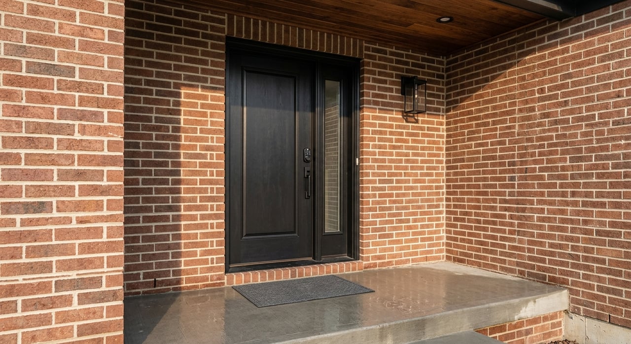
Argenta: downtown energy and mixed stock
What drives pricing
Argenta sits by the Arkansas River across from downtown Little Rock. You will find historic homes, townhomes, and some condo or mixed‑use options close to restaurants, galleries, and transit. Walkable amenities and arts activity often support buyer demand.
What to watch in the snapshot
- Inventory mix. Separate detached homes and townhomes or condos when possible so you are not blending different product types.
- Momentum signals. Rising median price plus lower DOM and a steady or rising sale‑to‑list ratio suggest broad demand, not just a few high‑end closings.
- Tightness. Months of supply near or under 3 months points to limited options and faster decisions.
Price bands to track
- Entry to mid bands under 350,000 dollars often draw first‑time and move‑up buyers who value proximity to dining and events.
- If the 500,000 dollars and up band grows, check whether new or renovated infill listings are setting fresh comps.
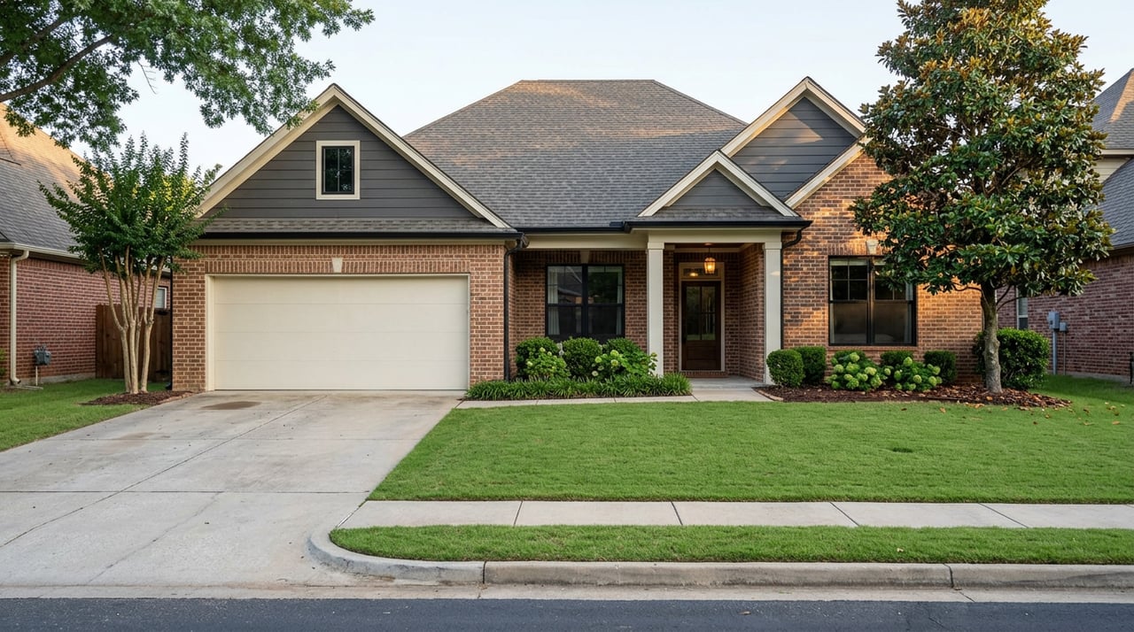
Park Hill: established homes and steady turnover
What drives pricing
Park Hill is an older, established area on the bluffs, known for its single‑family homes, larger lots, and tree‑lined streets. Housing stock tends to be older and unique, which can stretch days on market for one‑of‑a‑kind properties while preserving long‑term value.
What to watch in the snapshot
- Turnover. Expect fewer listings at any given time and pay close attention to months of supply.
- DOM and price mix. A few long‑marketing historic homes can pull DOM up, so look at median DOM and include sale counts to keep the picture clear.
- Renovation impact. Updated homes with thoughtful improvements can lift the sale‑to‑list ratio if buyers are competing.
Price bands to track
- The 350,000 to 499,000 dollars range often holds a sweet spot for updated, move‑in ready homes.
- Above 500,000 dollars, compare DOM and sale‑to‑list ratio carefully since unique properties do not always follow the broader trend.
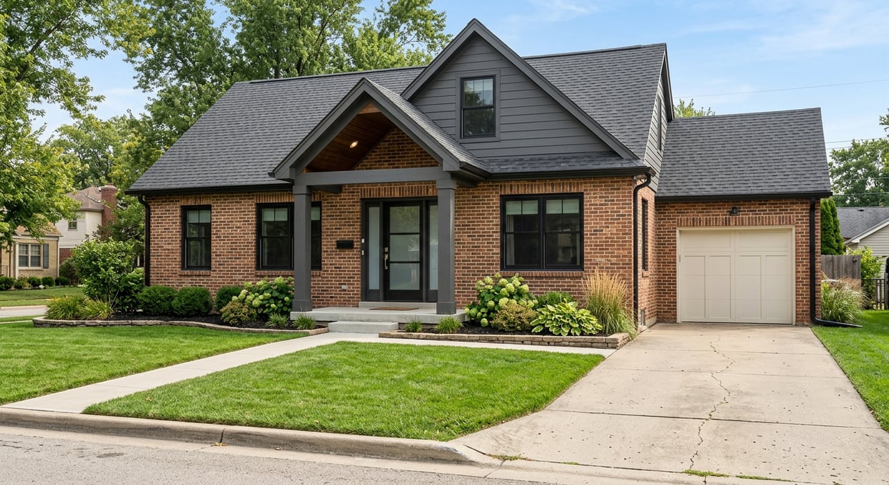
Lakewood: lakes, parks, and a broad range
What drives pricing
Lakewood covers residential areas built around several lakes and parks, with a mix of mid‑century homes and newer construction. Before you analyze, confirm boundaries since multiple “Lakewood” references exist in the county. HOA presence and amenity access can shape buyer interest.
What to watch in the snapshot
- Segment split. You may see different behavior between mid‑priced resale homes and newer builds. Track each segment’s DOM and sale‑to‑list ratio.
- Family‑oriented demand. Watch the 200,000 to 499,000 dollars bands for depth of sales and speed. This is often where move‑up buyers compare options.
- Inventory tightness. Months of supply under 3 months suggests faster competition, especially near the lakes and parks.
Price bands to track
- Under 350,000 dollars. This can move quickly if condition and location align with buyer expectations.
- 500,000 dollars and up. Review whether activity is broad or driven by a small set of higher‑end homes.
Side‑by‑side checklist to compare neighborhoods
Use this quick checklist to decide where momentum and tightness are strongest right now.
Active listings, last 30 and 90 days
- Argenta. Note mix of single‑family vs townhome or condo.
- Park Hill. Expect fewer total listings. Compare to 12‑month average.
- Lakewood. Confirm boundary. Look for split between resale and newer builds.
Closed sales and median price, last 90 days
- Argenta. Look for consistent price growth and a solid sale‑to‑list ratio.
- Park Hill. Check if medians are steady with modest upward trend.
- Lakewood. Watch if mid‑price bands carry most closings.
Days on market
- Argenta. Falling DOM supports momentum claims.
- Park Hill. Use median DOM to avoid skew from one‑off historic listings.
- Lakewood. Compare DOM by price band to spot the hottest ranges.
Months of supply
- Argenta. Under 3 months suggests tight inventory near downtown amenities.
- Park Hill. A tight reading can be very meaningful due to lower turnover.
- Lakewood. Under 3 months in mid bands points to strong family demand.
Sale‑to‑list ratio
- Argenta. Ratios at or above 98 percent signal firmer pricing.
- Park Hill. Updated homes may command higher ratios.
- Lakewood. Look for firm ratios in 200,000 to 499,000 dollars.
What this means for buyers
- If momentum is strongest in your target band, be ready. A pre‑approval, clear walk‑away number, and tight timelines give you an edge.
- If months of supply sits under 3 months, plan for fewer showings and quicker decisions. Ask for recent sale‑to‑list ratios to set your offer strategy.
- Consider adjacent bands. If 350,000 to 499,000 dollars feels crowded, you may find similar homes just under 350,000 dollars with faster negotiability.
- In neighborhoods with mixed inventory types, compare apples to apples. Separate detached homes from townhomes or condos in your analysis.
What this means for sellers
- Price with the trend, not the wish. Use 90‑day medians, DOM, and sale‑to‑list ratios for your micro area and property type.
- Presentation matters more in tight markets. Professional visuals, strong staging, and a clear launch plan can lift your sale‑to‑list ratio.
- Watch your band. If your price band is hot, a thoughtful list price can spark competition. If it is cooler, lean on timing, condition, and concessions.
- Track inventory weekly. If a competing home lists near you, adjust your strategy in real time.
How we build the neighborhood snapshot
You deserve a transparent process. Here is how a clean, local snapshot comes together.
- Boundaries. Use City of North Little Rock or Pulaski County assessor and GIS parcels to define Argenta, Park Hill, and Lakewood. Confirm the Lakewood polygon so you do not blend different tracts.
- Property types. Focus on detached single‑family homes and townhomes. Separate condos in Argenta if present, since they behave differently.
- Windows. Pull last 30, 90, and 365 days to balance recency and sample size. If a window has fewer than 10 sales, lean on the 12‑month trend and note it.
- Metrics. Calculate active inventory, new listings, closed and pending counts, median sale price, DOM for closed and active, sale‑to‑list ratio, and months of supply.
- Price bands. Break both active and closed data into the bands above. Track counts, median DOM, and sale‑to‑list ratio by band.
Interpreting the results
- Momentum. Rising median prices paired with falling DOM and months of supply under about 3 months point to strong momentum.
- Tight inventory. Declining active listings and low months of supply tell you to expect faster competition.
- Band‑specific demand. A neighborhood can be hot in one band and cool in another. Always read your specific band.
- Avoid false signals. If median price jumps while DOM also rises, it may be a few high‑end sales rather than broad demand. Check sale counts and bands.
Important caveats
- Small samples. Micro‑neighborhood comparisons can swing on a few sales. Always show sale counts next to medians.
- DOM differences. Some systems reset DOM when a listing relists. Confirm whether your DOM is cumulative or reset.
- Off‑market activity. Not all sales hit the MLS, which can make visible inventory look tighter than it is.
- Seasonality. Fall and winter often show lower inventory and fewer sales. Compare year over year when possible.
Argenta vs Park Hill vs Lakewood: quick takeaways
- Argenta. Expect more variety in property types. Momentum reads best when detached homes show rising medians, shorter DOM, and firm sale‑to‑list ratios.
- Park Hill. Lower turnover can mean fewer options but stable pricing. A tight months‑of‑supply reading is meaningful for timing and strategy.
- Lakewood. Mid‑price segments often drive the story. Confirm boundary and look for split behavior between newer builds and mid‑century homes.
If you want a clean, side‑by‑side table for the last 30, 90, and 365 days, we can prepare it using local MLS data and city parcel boundaries, with band‑level detail tailored to your price point and property type.
Ready to see your exact numbers and strategy by neighborhood and price band? Schedule a free consultation with Lindsey & Krystina Realtors. Our boutique, visual‑first marketing and local MLS expertise help buyers move decisively and help sellers capture stronger list‑to‑sale results.
FAQs
What is the best way to compare Argenta, Park Hill, and Lakewood right now?
- Use the last 90 days for median price, DOM, sale‑to‑list ratio, and months of supply, then confirm trends with the 12‑month view to reduce noise.
How do I know which neighborhood has the tightest inventory?
- Look for months of supply under about 3 months paired with stable or rising sale‑to‑list ratios and falling DOM in the same period.
Which price bands are moving the fastest for family‑sized homes?
- Filter by 3 or more bedrooms and then compare DOM and sale‑to‑list ratio by band, especially in the 200,000 to 499,000 dollars range.
How should I adjust my offer strategy in a hot price band?
- Get pre‑approved, watch new listings daily, and use recent sale‑to‑list ratios to set a clear, competitive ceiling before you write.
What if I see median prices rising but days on market also rising?
- That mix can signal outliers at the higher end. Check the number of sales and the spread across price bands before you draw conclusions.
Can you include condos in the snapshot for Argenta?
- Yes. For the clearest read, run separate views for detached homes and for condos or townhomes, then compare both sets by the same metrics.